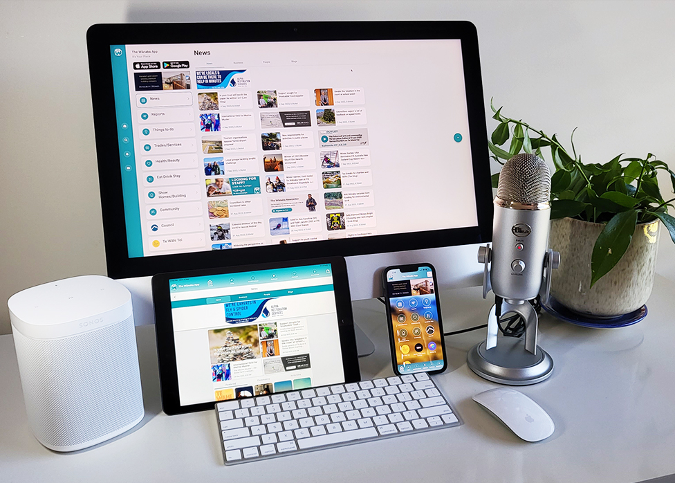
The iAppNetwork has just released a platform update that improves the reader experience on iPad and tablet devices.
The update means that iApp mobile apps are now responsive to the screen size, orientation, and display modes for iPads and tablets.
“It is exciting to be able to bring a much-anticipated update for larger devices,” iAppNetwork co-owner Tony O’Regan said.
“Approximately 10% of monthly readers use those devices so it is nice to be able to deliver them a better experience.”
Tony said that readers on iPads and Tablets will notice ‘a lot of improvement’.
“The whole screen layout is designed for the device which makes it easier to navigate and view,” he said.
“Images will now be responsive to the device, and pages will respond to screen size with two and three-column layouts depending on the page.”
Publishers licensing the iAppNetworks software platform require no coding experience and can easily and quickly create multiple distribution channels designed for mobile, iPad/tablet and desktop.
iApp’s multi-channel offering is specifically designed for local publishers, delivering a comprehensive tech stack.
If you have a question about this update please email [email protected]

